This was a sort of mini-project that we had to do. The whole assignment focused on lines, and how it relates to other lines. We were to cut out lines from our black construction paper, and arrange them on a 8x10 bristol board. We had to paste the construction paper with rubber cement so it wouldn't wrinkle like other glue materials do, and we could easily clean up the mess we made with a pic-up square. This was my first time using rubber cement and a pic-up square. I actually found it quite fun that we could "erase" the areas that were actually too much. I think at times I even applied too much so that I could go back and "erase" but let's leave that thought for another time. We were to design four pieces. The first 8x10 included only horizontal and vertical lines, the second only diagonal lines, the third only curved/fluid lines, and the fourth a combination of all three.

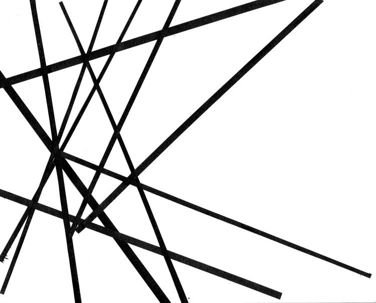
This first design was made completely out of diagonal lines. I'm not sure what it would resemble though that's okay considering that the whole project was made to be non-objective. If I were to look at the whole thing, to me it looks somewhat like a web of sorts. It reminds me of a spider-like web, though not as pretty and lots of weaving.
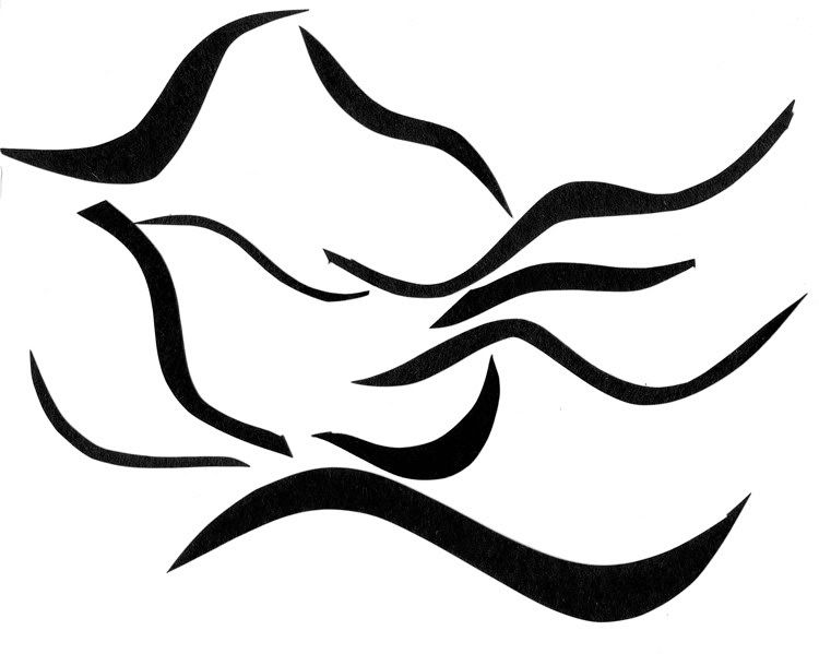
This second design was composed completely of curved lines. I don't know if you can completely see the image that comes to mind, but it resembles a bird standing atop something. I think I would have to re-do this one because it didn't go along with the whole non-objective idea because it resembles something real-life. I just liked how the lines actually made an image. Maybe if I had overlapped a few of the lines, I would've strayed away from being an objective image. I'll have to reconstruct this piece later so that I can get a better concept of it.


 This first design was made completely out of diagonal lines. I'm not sure what it would resemble though that's okay considering that the whole project was made to be non-objective. If I were to look at the whole thing, to me it looks somewhat like a web of sorts. It reminds me of a spider-like web, though not as pretty and lots of weaving.